Featured App
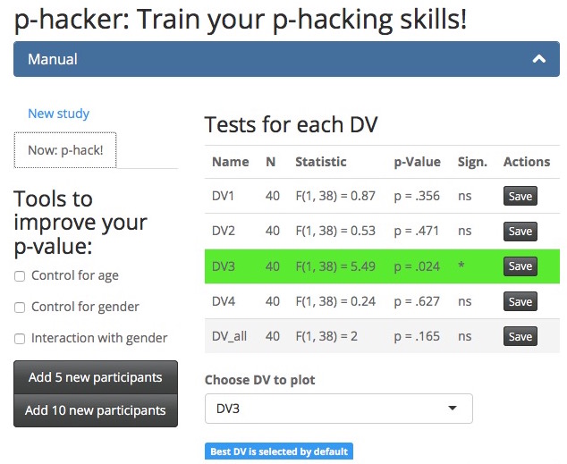
p-hacker: Train your p-hacking skills!
by Felix Schönbrodt
p-valuesteachingTrain your expert p-hacking skills with the interactive p-hacker app! Who gets p<.05 first?
Shiny widgets Experience statistics
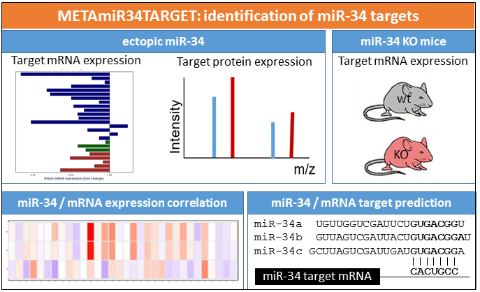
METAmiR34TARGET - Meta-analysis of microRNA-34 target mRNAs
by Matjaz Rokavec
GenomeThis app allows to identify potential microRNA-34 targets by combining computational miRNA target prediction resources with experimental transcriptomic and proteomic datasets derived from cell lines, mouse models, and tumor tissues.
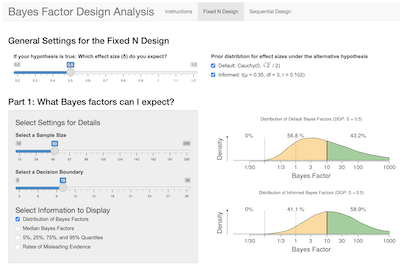
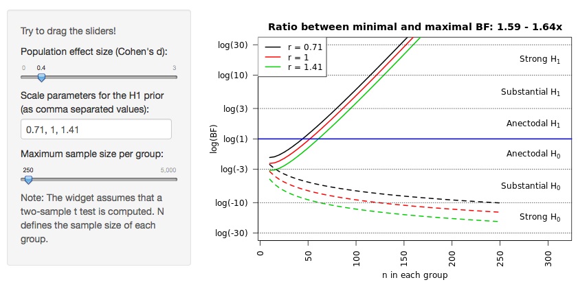
BFDA - A Shiny App for Bayesian Design Analysis
by Angelika Stefan
BayesThis Shiny app helps researchers with sample size planning for Bayesian independent-samples t-tests, using Bayes Factor Design Analysis (BFDA), a simulation-based framework for Bayesian power analyses.
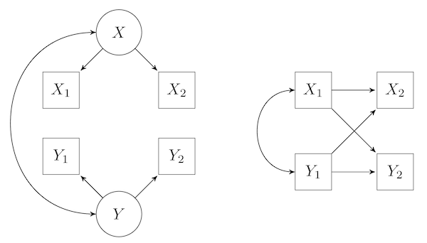
Examining the Effects of State and Trait Variance on Estimates of Cross-Lagged Associations
by Richard Lucas
SEMThis app generates 10 waves of data for two variables, based on a bivariate "stable trait, autoregressive trait, state" (STARTS) model and then runs a standard cross-lagged panel model, and a random-intercept cross-lagged panel model on the data. The purpose of the app is to examine how the estimated cross-lagged paths in the standard cross-lagged panel model and the random-intercept cross-lagged panel model are affected when stable-trait or state variance exists but is omitted from the model.
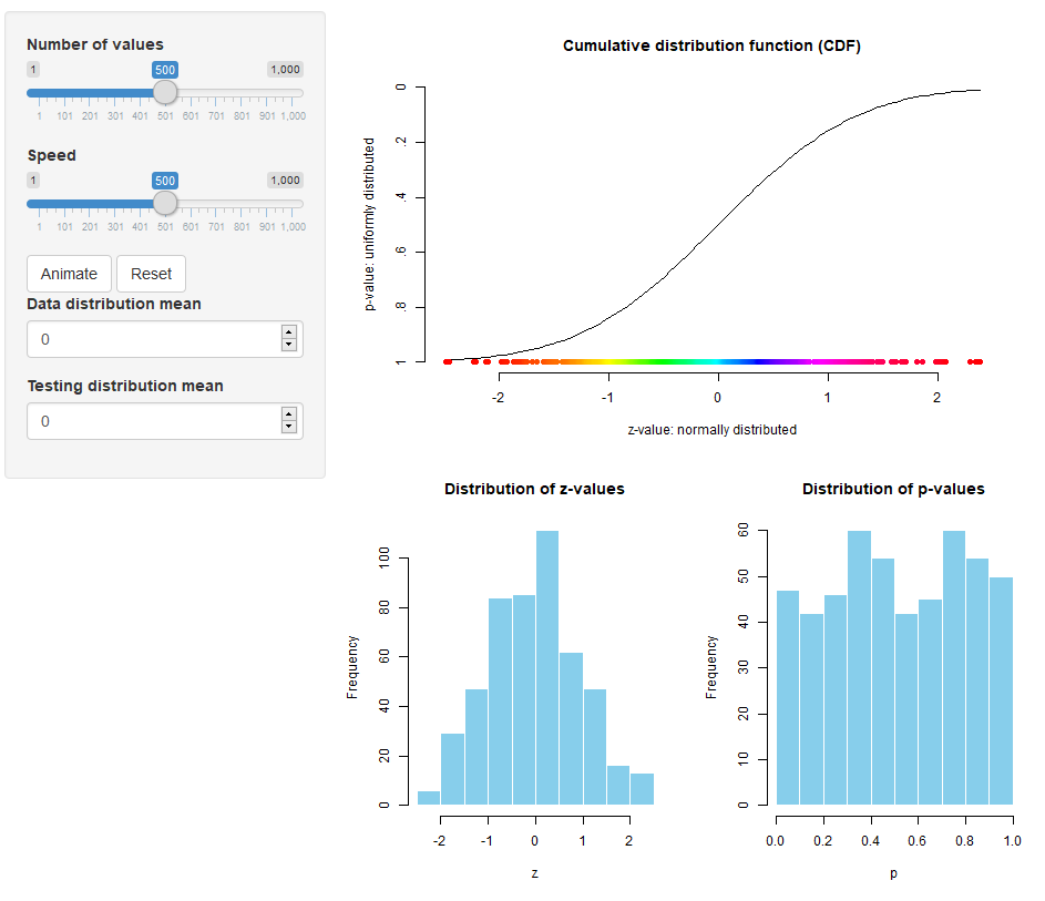
From z to p: A visualization of the link between the two distributions
by Sven Hilbert
p-valueplotEver wondered why p-values are uniformly distributed if the H0 is accurate, even though the data are normally distributed? This animated app visualizes the connection of the two via the CDF and lets you explore the relationship between effect size and skewness of the distribution of p-values.
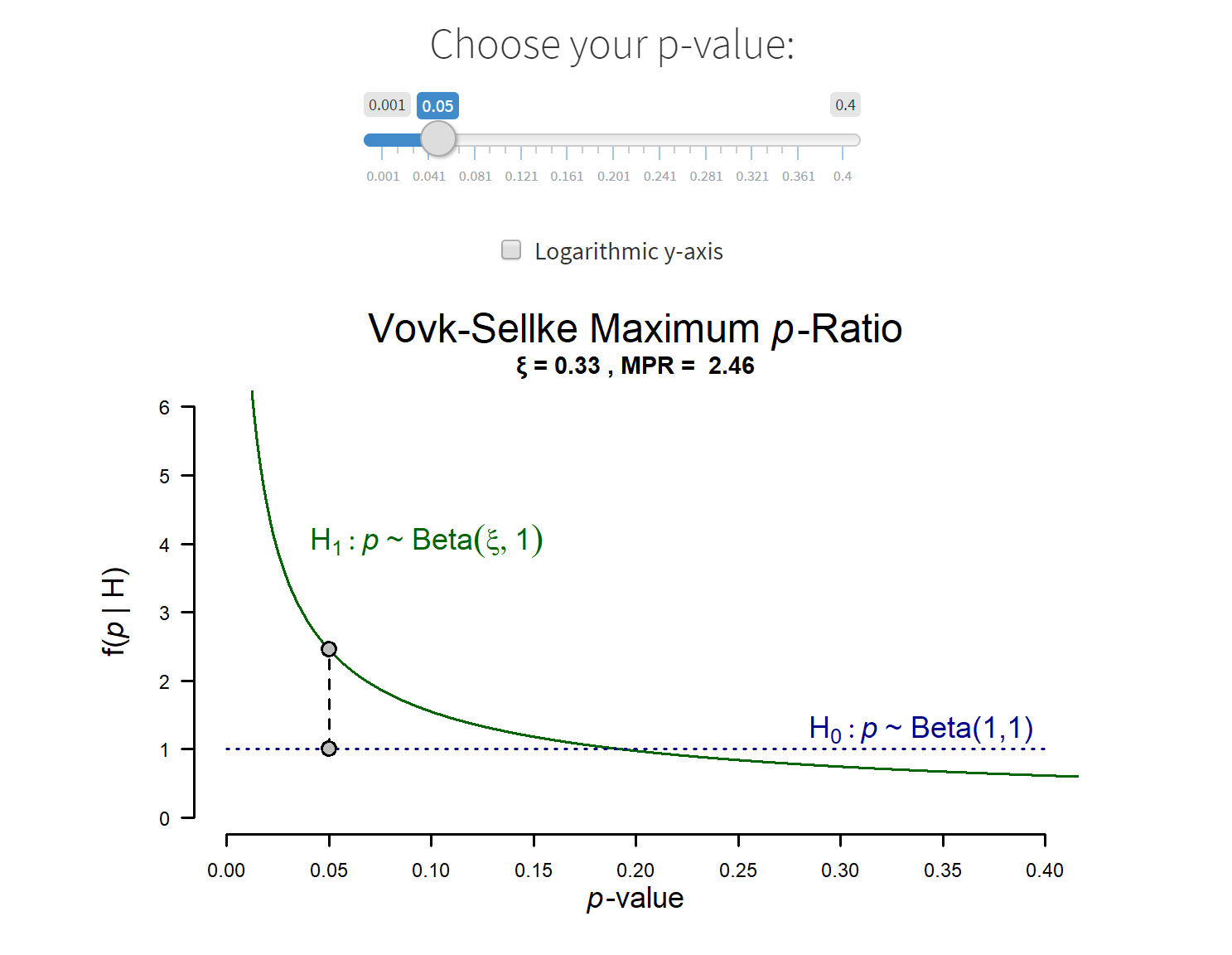
Exploring the diagnosticity of the p-value
by Erik-Jan van Kesteren and Eric-Jan Wagenmakers
p-valueplotdiagnosticityExplore the Vovk-Sellke Maximum p-Ratio, a measure that indicates the maximum diagnosticity of a given p-value. Choose your own p-value to find out how diagnostic it is for your research!
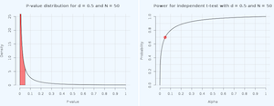
P-value distribution and power curves for an independent two-tailed t-test
by Daniel Lakens
p-valuepowerPlot the theoretical p-value distribution and power curve for an independent t-test based on the effect size, sample size, and alpha.
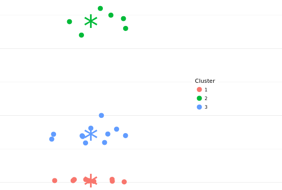
Univariate k-Means Clustering with elbow method
by Jan Freyberg
clusteringIdentify how many clusters your one-dimensional data can be grouped in and how much variance you can explain with these clusters by using the "elbow method".
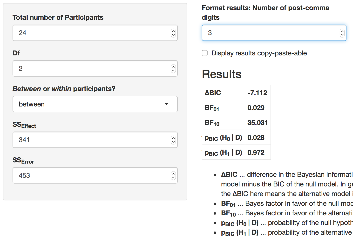
BIC approximation for ANOVA designs
by Christoph Huber-Huber
BayesObtain a Bayesian interpretation of your ANOVA results with this app. You just need to enter your sum of squares and some information about your design.
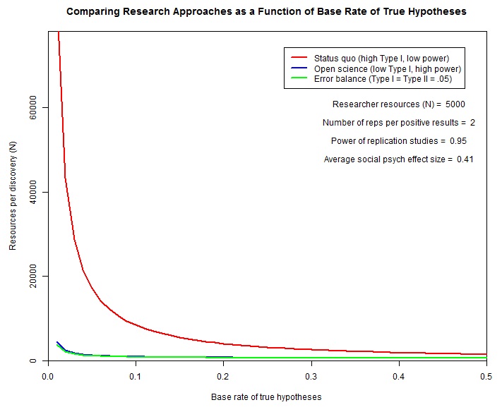
N per discovery
by Etienne LeBel
paperApp to explore the cost-effectiveness of different research approaches to unearth true scientific discoveries.
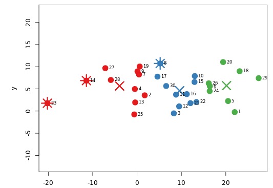
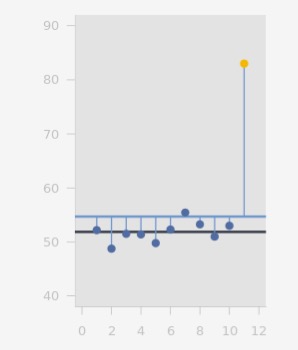
2D Outlier analysis
by Rajiv Shah
outlierThe app allows you to see the trade-offs on various types of outlier/anomaly detection algorithms. Outliers are marked with a star and cluster centers with an X.
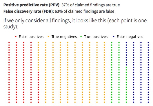
When does a significant p-value indicate a true effect?
by Michael Zehetleitner and Felix Schönbrodt
teachingUnderstanding the Positive Predictive Value (PPV) of a p-value.
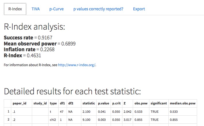
p-checker: The one-for-all p-value analyzer
by Felix Schönbrodt
p-valueThis Shiny app implements the p-curve (Simonsohn, Nelson, & Simmons, 2014; see http://www.p-curve.com) in its previous ("app2") and the current version ("app3"), the R-Index and the Test of Insufficient Variance, TIVA (Schimmack, 2014; see http://www.r-index.org/), and tests whether p values are reported correctly.
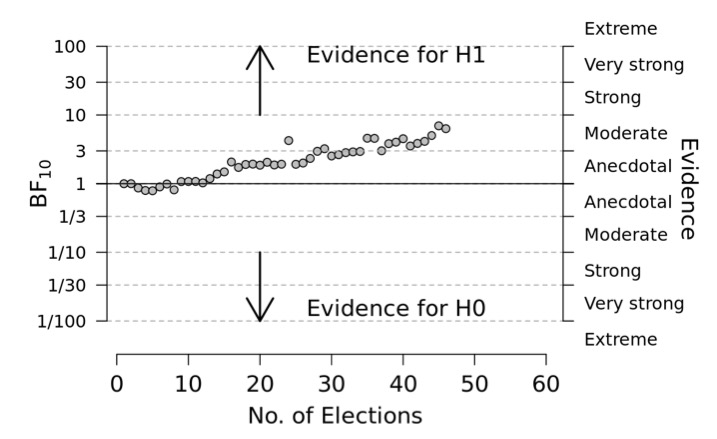
What does a Bayes factor look like? (2) Height difference between males and females.
by Felix Schönbrodt
BayesteachingCan you "see" a group mean difference, just by eyeballing the data? Is your gut feeling aligned to the formal index of evidence, the Bayes factor?
What does a Bayes factor look like? (1) The urn model.
by Felix Schönbrodt
BayesteachingHow much is a BF of 3.7? Well, it is "moderate evidence" for an effect - whatever that means. Let's approach the topic a bit more experientially. What does such a BF look like, visually? We take the good old urn model as an example.
A First Lesson in Bayesian Inference
by Eric-Jan Wagenmakers
BayesThis app highlights several key Bayesian concepts.
A Compendium of Clean Graphs in R
by Eric-Jan Wagenmakers
BayesplotWhen done right, graphs can be appealing, informative, and of considerable value to an academic article. This compendium facilitates the creation of good graphs by presenting a set of concrete examples, ranging from the trivial to the advanced. The graphs can all be reproduced and adjusted by copy-pasting code into the R console.
Bayes factor robustness
by Felix Schönbrodt
BayesplotCheck how your Bayes factor conclusion depends on the r-scale parameter.
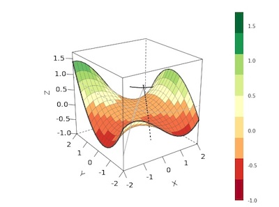
Polynomial Surface Explorer
by Felix Schönbrodt
regressionplotAdjust regression parameters to bend and shift a two-dimensional polynomial surface.
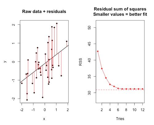
Find-a-fit!
by Felix Schönbrodt
regressionplotgameBe an optimizer: Find the best linear fit!
Robustness of Mean and Median
by Tobias Kächele
quizWhich is more robust against outliers: Mean or median?
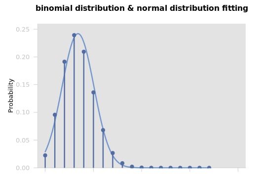
Normal distribution vs. binomial
by Tobias Kächele
quizdistributionApproximating a normal distribution with a binomial distribution
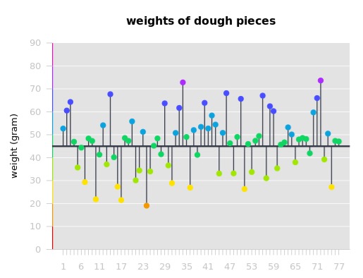
Production errors
by Tobias Kächele
quizhistogramdistributionGet acquainted with histograms.